

Has Mozilla Firefox accidentally leaked its new logo before the grand reveal?
[Image: CNET]
There has been a leak, people. A big ‘ole leak.
Firefox announced last year that there would be a redesign on their sleek fox logo. They even asked their designer fans to help them come up with a new logo design.
After a year of anticipation and long waiting to see the new design, and well… It’s been leaked a week early.
The redesign was scheduled to be released on June 10th, 2019. Firefox started pumping up their users by releasing a teaser video on Twitter explaining why people should use their browser, as opposed to others, and the benefits that come along with using Firefox.
And then, this happened:
I am ready. pic.twitter.com/TaB3tX8UZZ
— mart3ll+ (@mart3ll) June 4, 2019
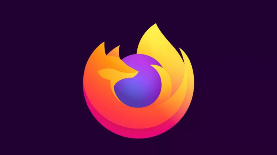
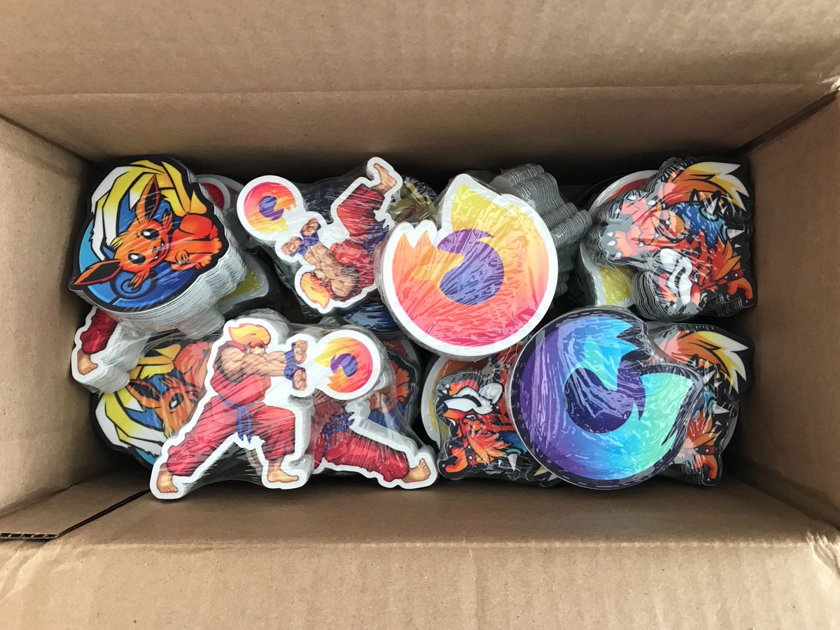
In the comment section of the video, you’ll see, Sean Martell, Firefox’s communication design leader,posted a picture. And to the standard by-passer, it’s just a cool picture of Mozilla’s new merch. Right? Wrong.
Look closely and amongst the merch, you’ll see the new, sleek design all over the place.
We really dig this new, modern design that Firefox has come out with. The color gradient is similar to the old one, and it looks like the fox got a little grooming on his coat as well.
Also, did you notice that blue-green logo? It’s a big change, but it looks amazing, and we’re living for it.
The logo is still very recognizable and distinguishable and is not as shocking as some other logo redesigns we have seen in the past. It’s almost always a great idea when redesigning your logo to try to keep some original elements from your first logo so that your users and clients will still recognize your logo from a crowd.
This time, the fox is looking toward us, as opposed to the past fox that was looking away from us. It almost gives you the sensation that the fox is looking out for you.
But although the logo redesign is amazing, that doesn’t change their number of monthly users which has continued to decline over time. But Mozilla is not about to quit. They’ve come up with amazing safety and user privacy features that completely distinguish themselves from Google Chrome, their biggest competitor.
Getting back to Mozilla’s new logo design though, if you remember, Tim Murray, Mozilla’s creative director, came up with two different styling systems for their redesign last year; system 1 and system 2 And to us, it seems like they went forward with the ideas of system one, and we’re thrilled about it.
With its clean, sleek, and stylized graphics, it still embraces the current flat design trend, instead of a displaying a skeuomorphic design. So new the logo is still pushing the same flat design trend as it did before, staying true to its original design.
Mozilla still hasn’t commented on the early leak, but all in all, we are happy it was released early because we were impatiently waiting to see what Mozilla new logo would look like.
If you’re planning on a redesign, we have 10 features of a good logo that you need to consider and implement during you’re redesign process.
Let’s Talk
We want to know you think about Mozilla’s potential new logo. Was the leak intentional? Was it actually just a PR move?
Let us know down in the comments below what you think and let’s discuss the new design, particularly the green one.
Until next time,
Be kind and stay positive!