

Kroger is hands-down one of my favorite grocery stores ever.
And I’m not the only one, apparently.
With 2,800 stores nationwide and in 35 states, Kroger is easily the largest grocery store retailer in the United States of America.
Kroger has been around for a long, long time.
I’m talking over 100 year’s time! Kroger was established in 1883 in Cinncinatti, where the Kroger headquarters still is.
Not only does Kroger have over 500,000 (yes, folks, you heard correctly. That’s five-hundred-thousand employees), but they also donate hundreds of millions of dollars to help feed the hungry all over the country.
Now that’s the kind of grocery store I want to be a part of.
And I have been!
For years my family and I shopped at Kroger and to this day, we still do.
That’s why I wanted to talk a little bit about the new logo and slogan that they came out with at the end of last year.
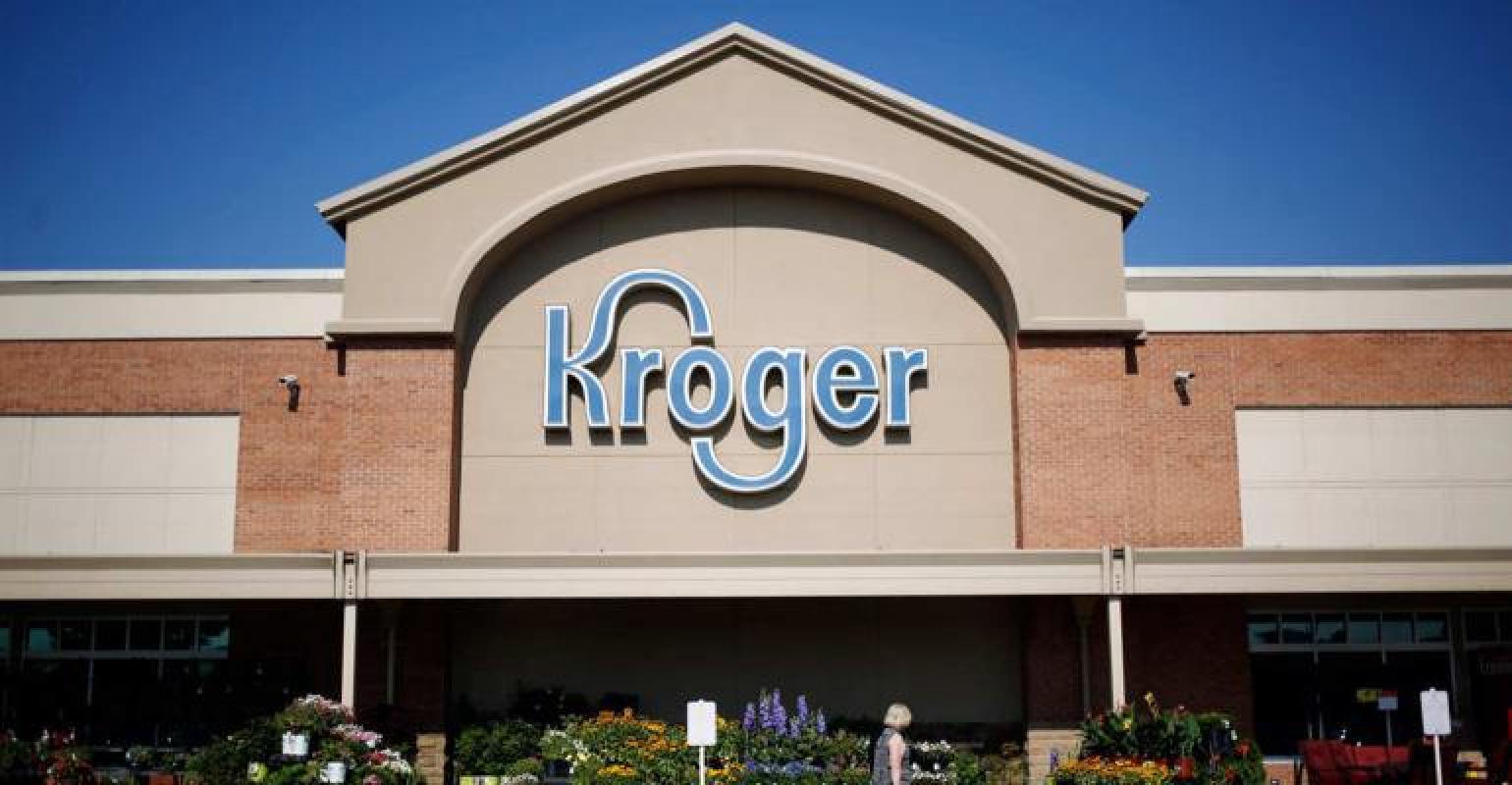
As I said, Kroger has been around for a long, long time. And because they’ve been around for so long, you can imagine that their logo can quickly become dated.
One thing that completely distinguishes Kroger from other brands the curvy letters.
The “K” and “G” have a very distinct, curvy look to them that you don’t just see around.
![]()
And with this unique design, you either love it or hate it.
I’ve read loads of comments and talked to other Murfreesboro web designers who absolutely hate the curves.
But are the curvy letters what really brings the brand to life?
If they were to drop the curves, which, visually speaking would probably be the best thing to do, they would lose brand recognizability.
Since the brand has been repping the unique font for so long, it’d just feel wrong to change it so drastically at this point.
The logo went from a 3D realistic style to minimal, flat design, which is a trend we’ve been seeing from huge brands all through-out 2019.
![]()
Beyond changing the font to be a little simpler and with better tracking, the also dropped the 3D border that they had before.
Which to me seemed to be the smart choice.
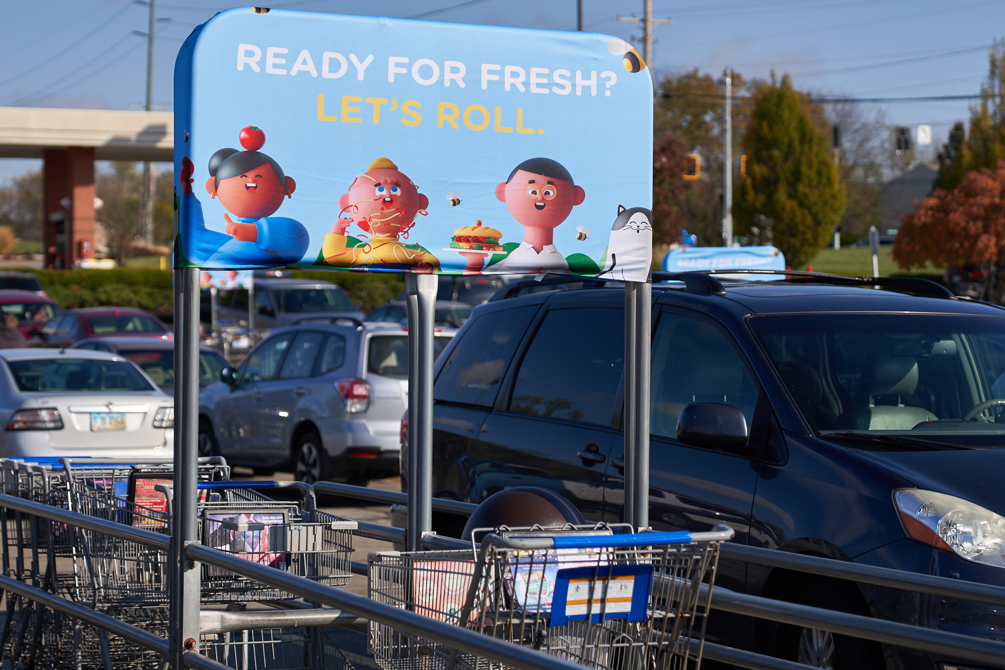
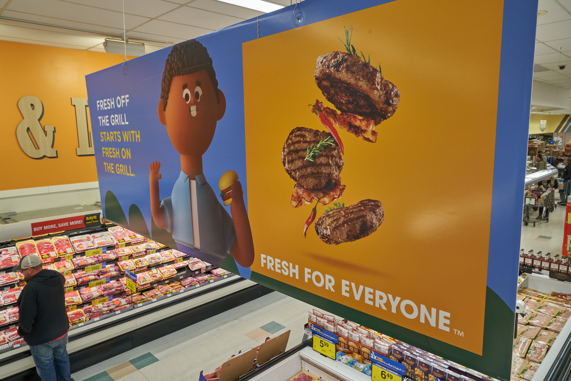
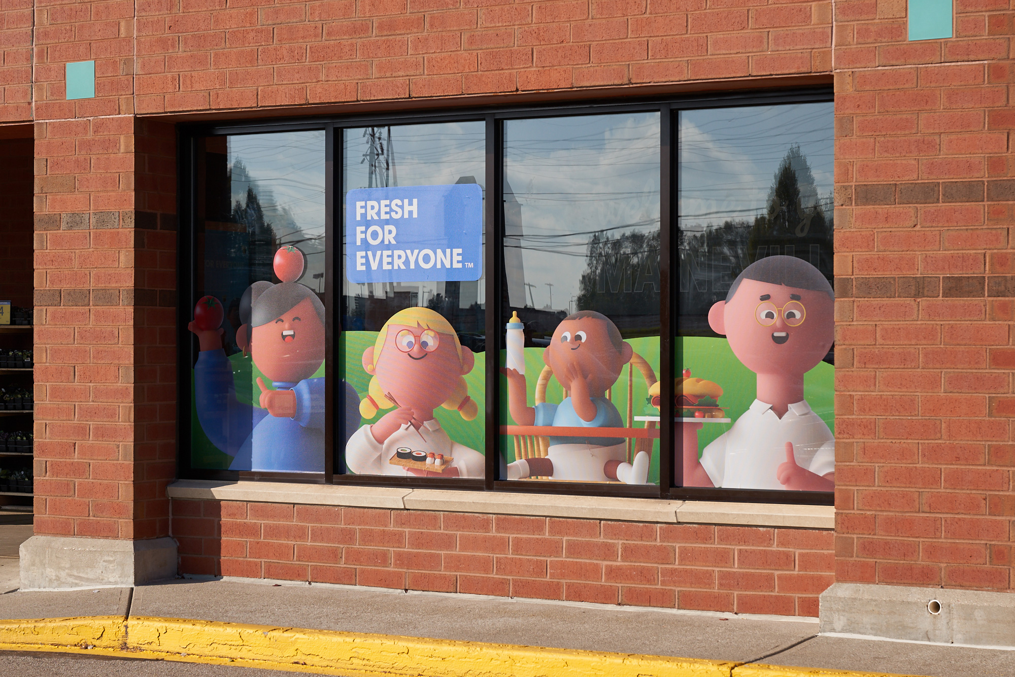
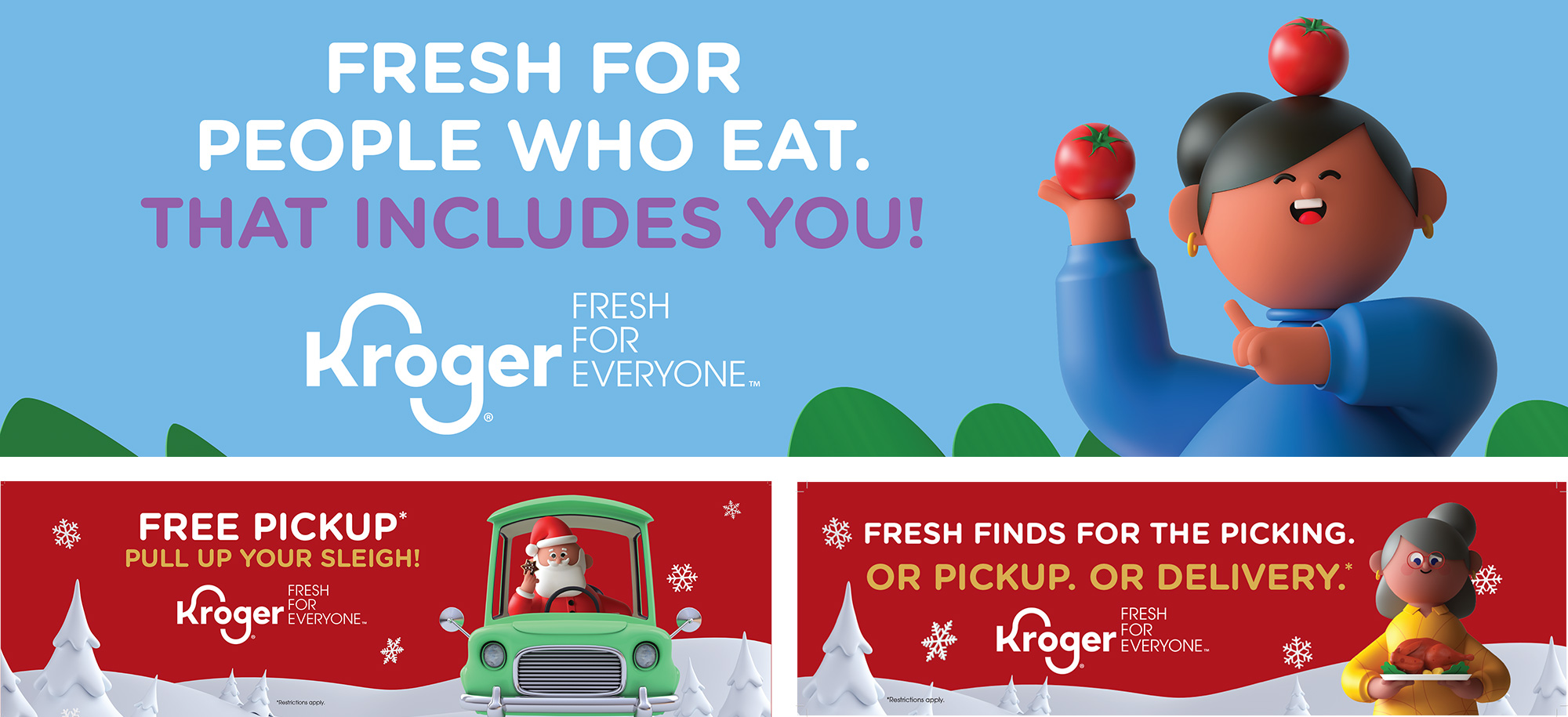
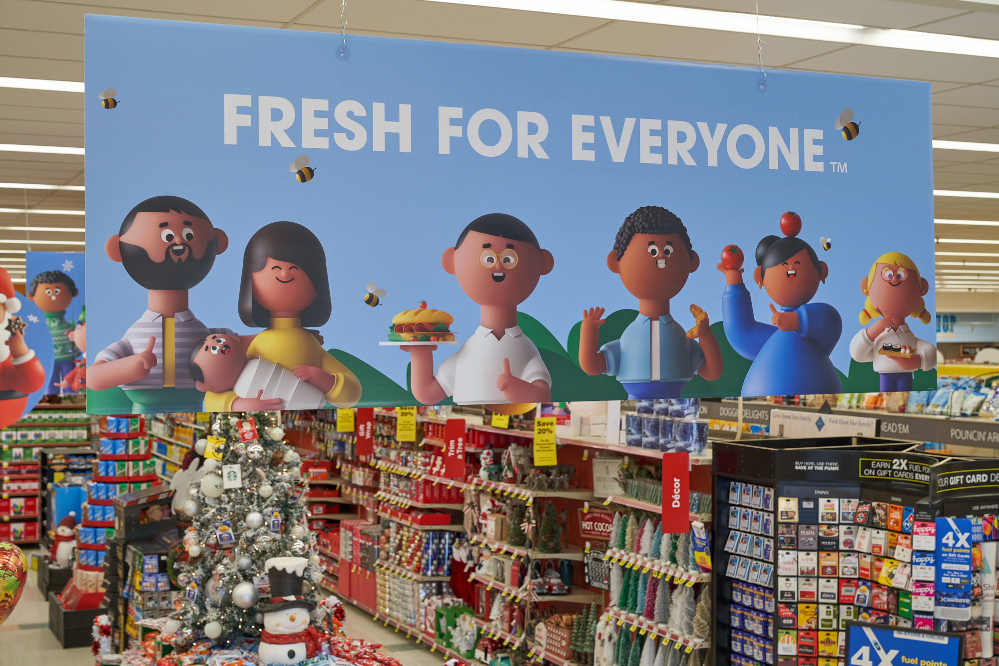
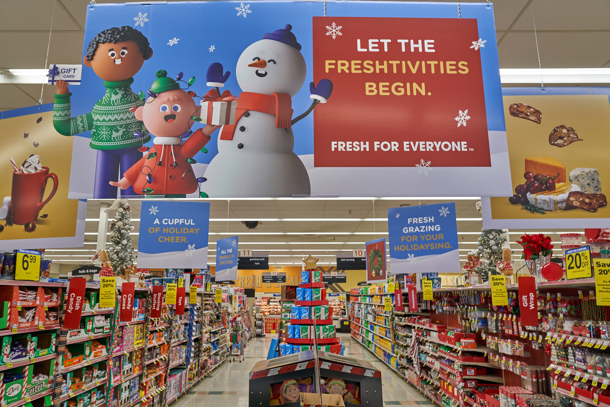
They also threw in a slogan now.
“Fresh is for everyone.”
Which is just what we need to see and hear in 2020.
Their commercial just about sums it up.
And “What are all those little animated people called?”, you may ask.
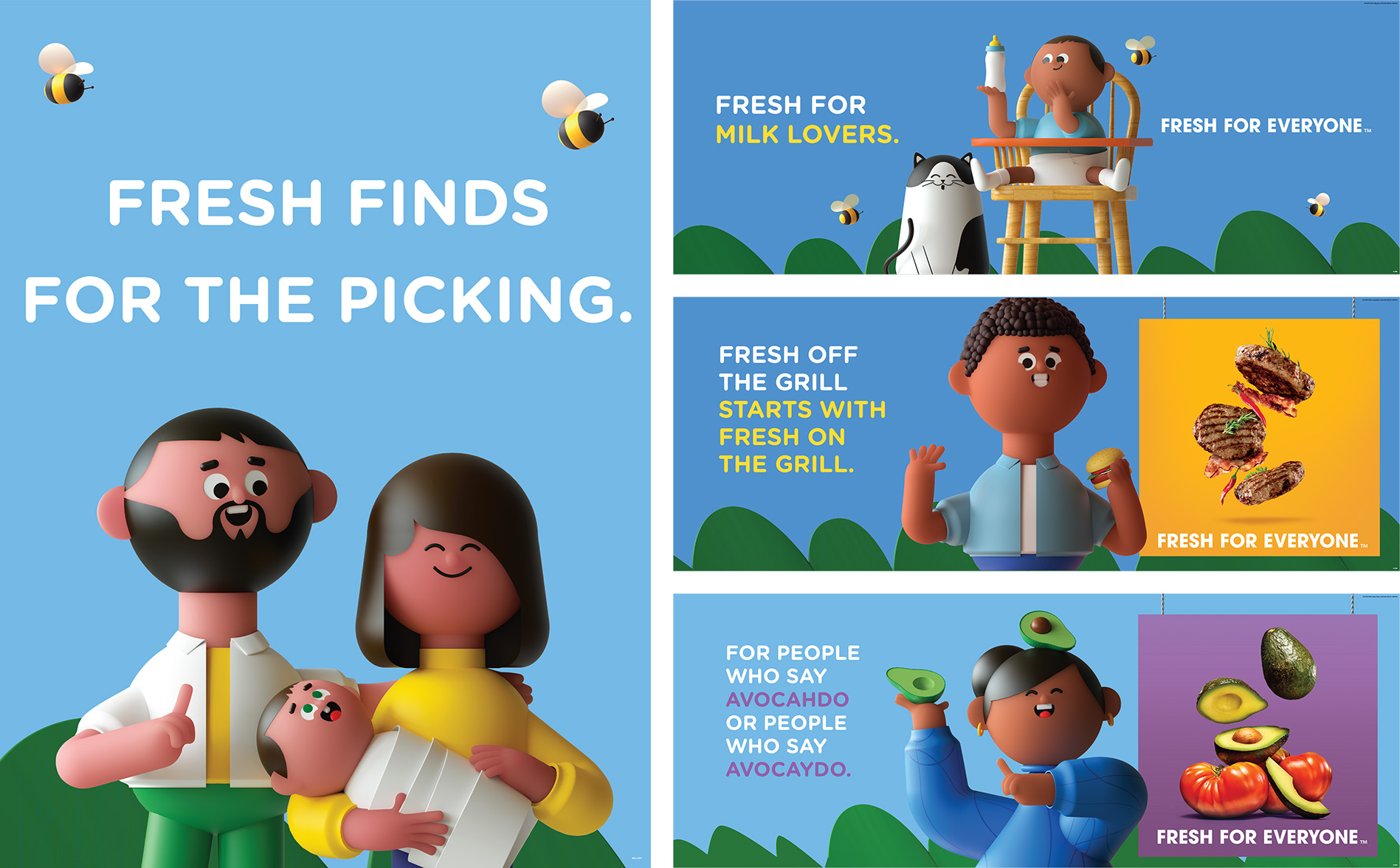
Well, those adorable little animations are called Krojis.
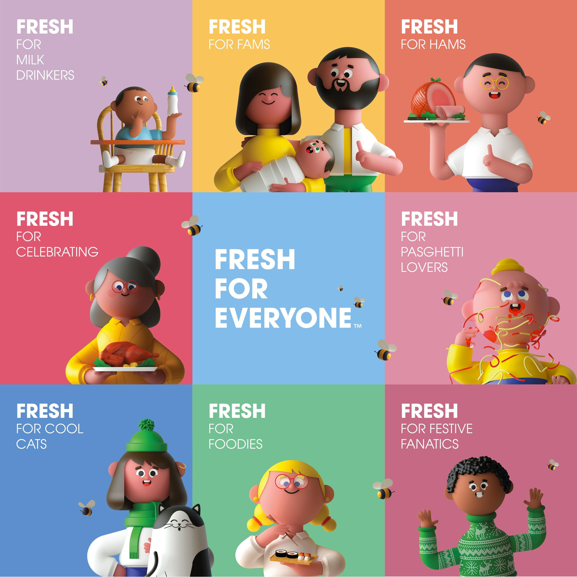
Only the cutest grocery store representatives I’ve ever seen.
The versatility you can get with these characters is amazing. The commercial was very relatable and inclusive, which I personally loved.
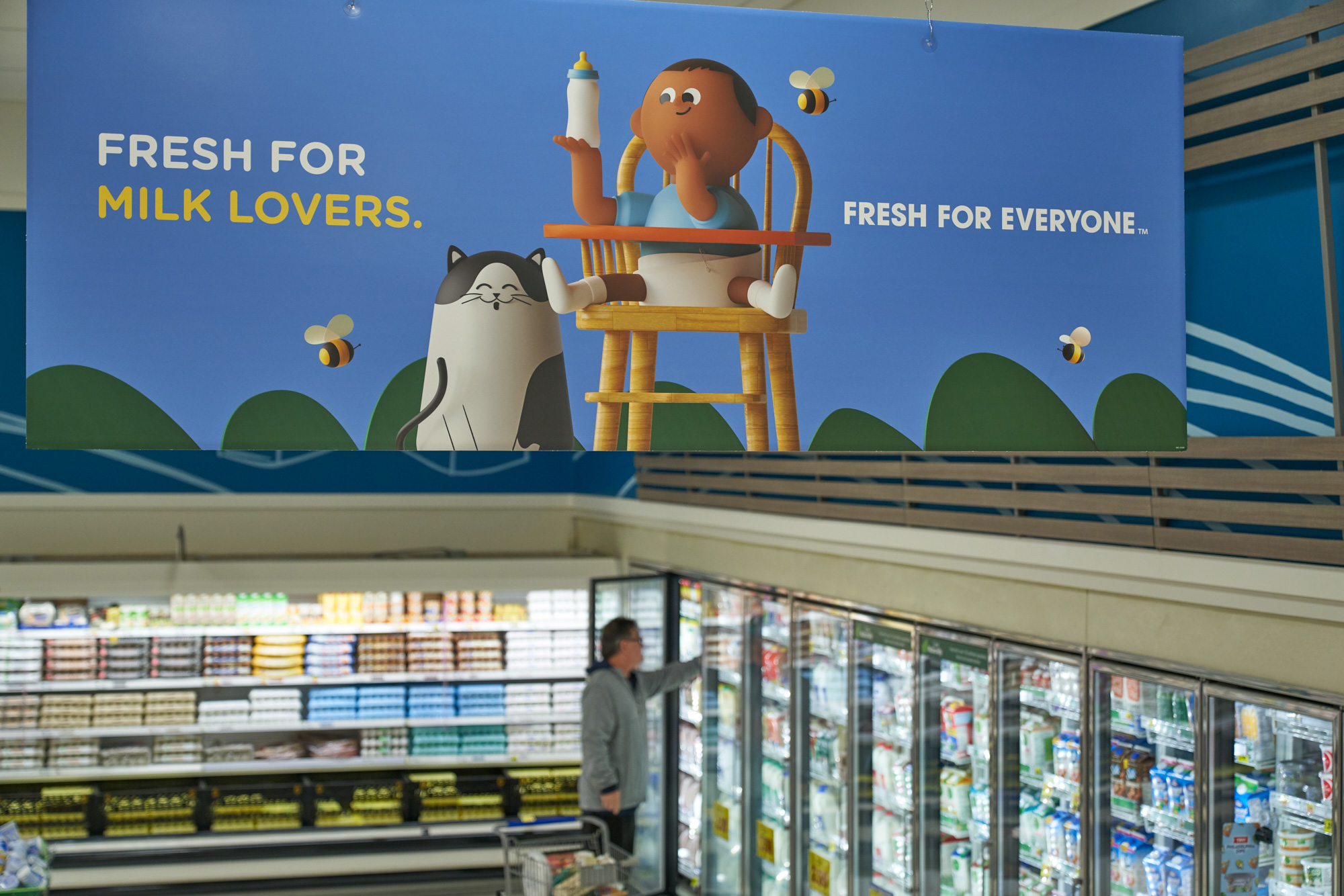
Having them on every sign in the store though does seem a bit overwhelming and excessive, but hey. They’re just trying to make us remember them, I suppose.
I think Kroger is on just the right path to becoming more relevant and modern, design-wise.
What do you guys think of all these new changes and the little Krojis?
I know many of us are in an uproar about the combination of fonts that they chose to go with.
A rounded sans serif with ITC Avant Garde Gothic… Maybe not the best choice to go with.
Be we want to know your thoughts on everything.
Let us know in the comments what you think about Kroger’s new logo and slogan.
Until next time,
Stay creative, folks!